7 Best Color Wheels For Selecting Intarsia Palettes
Master intarsia with these 7 essential color wheels. Learn to balance hues, contrast, and saturation to create stunning, professional-grade wood palettes.
Selecting the perfect palette for an intarsia project is often the most daunting step for even the most experienced knitters. While we often rely on our gut feelings, a structured approach to color theory prevents the heartbreak of a finished sweater that feels "off." These seven tools provide the technical scaffolding you need to move beyond safe, neutral choices. By mastering these wheels, you can confidently manipulate contrast and saturation to make your intarsia motifs truly pop.
The Color Wheel Company Creative Color Wheel


This is the gold standard for many artists because it provides a comprehensive breakdown of color relationships beyond just the basic primaries. It features a rotating dial that illustrates how colors interact when you mix them, which is surprisingly helpful for visualizing how different yarn shades will blend visually when knitted side-by-side.
For intarsia, the value lies in the "tints, tones, and shades" window on the back. When you are trying to decide if a heathered grey will clash with a bright neon yellow, this wheel lets you see the underlying hue clearly. It removes the guesswork of looking at a skein under fluorescent store lighting.
The trade-off is its size; it is a bit bulky to keep in your project bag. However, for planning a complex, multi-colored graph, it is an indispensable desk companion.
Pocket Color Wheel: Best for Yarn Shopping

When you are standing in a local yarn shop surrounded by hundreds of skeins, you need something that fits into your palm. The Pocket Color Wheel is designed for quick, on-the-go decision-making when you’re trying to match a new contrast color to your main yarn.
It is simple and stripped back, focusing primarily on the basic color relationships like complementary and analogous schemes. It doesn’t have the deep technical data of larger wheels, but that simplicity is its greatest strength. You aren’t distracted by extra information when you just need to know if a teal will work with a rust-colored wool.
Keep in mind that it is made of cardstock, so it won’t survive a spill in your knitting bag. Keep it in a small plastic sleeve to ensure it lasts through many shopping trips.
Pantone Color Match Card: Precise Color Picking

If you are working from a specific digital pattern or trying to replicate a precise artistic vision, the Pantone Color Match Card is a game changer. It allows you to use your smartphone to capture a color and match it to the Pantone system, which is the industry standard for color accuracy.
This is particularly useful if you are ordering yarn online where monitor calibration can make colors look drastically different than they appear in person. By identifying the exact Pantone shade, you can cross-reference it with yarn manufacturers who often list Pantone equivalents for their colorways.
It requires a bit of tech-savviness to use effectively, but the precision is unmatched. It’s the tool for the knitter who demands professional-grade consistency in their colorwork.
Color Mixing Wheel for Intarsia Color Theory
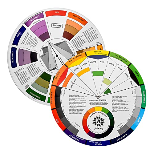
This wheel is specifically geared toward the mechanics of color mixing, which is vital for intarsia knitters who want to create depth. By showing how colors shift when mixed with white, gray, or black, it helps you understand how to create a gradient within your intarsia blocks.
Intarsia often looks flat if the contrast is too uniform. By using this wheel to select a "shade" of your main color for a shadow effect, you can add a three-dimensional quality to your work. It teaches you that contrast isn’t just about color; it’s about the value—how light or dark the yarn is.
Don’t be intimidated by the mixing terminology; think of it as a map of how your yarn colors will relate to each other on the fabric. It helps you avoid "muddy" palettes where colors bleed into each other visually.
Blick Essentials Color Wheel for Fiber Artists
The Blick Essentials wheel is a sturdy, no-frills tool that is excellent for beginners. It clearly marks primary, secondary, and tertiary colors, making it easy to identify harmonious palettes for your first intarsia project.
It is less about artistic nuance and more about foundational color logic. If you struggle to understand why a certain blue looks "wrong" next to a certain green, this wheel will show you the exact relationship between them. It’s a great way to build confidence before moving on to more complex, high-contrast designs.
Because it is inexpensive and durable, it’s the perfect wheel to keep in your primary knitting kit. It serves as a constant reminder of the rules of color before you decide to break them.
Westcott Color Wheel for Intarsia Palette Work

The Westcott wheel is often favored by designers because of its clear, high-contrast printing and easy-to-read labels. When you are laying out a large intarsia chart, having a wheel that is easy to read at a glance saves time and frustration.
It excels at showing "split-complementary" schemes, which are often the secret to sophisticated, professional-looking intarsia. Instead of just picking two colors that are polar opposites, this wheel helps you find a third color that adds interest without overwhelming the design.
It is a bit larger than a pocket wheel, so it’s best suited for your home studio or dedicated knitting space. It’s a reliable, steady tool that won’t let you down during long design sessions.
MyPerfectColor Wheel for Knitting Projects
This tool is unique because it is designed specifically for those who care about color fidelity across different materials. It helps you understand how color behaves across different fiber types, which is essential because wool, silk, and cotton absorb dye differently.
When you are mixing fibers in an intarsia project—like a wool background with silk motifs—the color will look different due to the fiber’s luster. This wheel helps you anticipate that shift so you aren’t surprised by the final result.
It is a more specialized tool, but for the advanced knitter who experiments with texture and fiber blends, it is worth the investment. It bridges the gap between color theory and fiber science.
How to Use a Color Wheel for Intarsia Planning
To start, lay your yarn samples out on a neutral, white surface. Use the wheel to find your main color, then rotate the dial to see the complementary or analogous options that align with your vision.
For intarsia, always test your chosen colors by holding them together in a small swatch. A color wheel can tell you the colors look good together, but it cannot tell you how they will look once knitted into a dense fabric. Always swatch at least a small square to see how the colors interact in your specific gauge.
Remember that contrast is your best friend in intarsia. If two colors are too close in value, the design will be invisible from a distance. Use the wheel to ensure you have enough light-to-dark variation to make the motif stand out.
Understanding Tints, Tones, and Shades in Yarn
Understanding these three terms will transform your colorwork. A tint is your base color mixed with white, a tone is mixed with gray, and a shade is mixed with black.
In intarsia, you can create a beautiful, subtle design by using different tones of the same hue. This is much easier on the eyes than high-contrast, neon-bright palettes and often results in a more elegant, high-end garment.
If you are struggling to make a design look "cohesive," try shifting your palette toward a single tone. By keeping the level of gray in each yarn consistent, you create a natural harmony that feels intentional and well-planned.
Tips for Balancing Contrast in Intarsia Knits
The most common mistake in intarsia is ignoring the "squint test." When you think you have a perfect palette, squint your eyes at the yarn samples; if they all blur into one indistinct color, your contrast is too low.
- Check the WPI (Wraps Per Inch): Ensure your contrast colors are of similar weight, or the intarsia blocks will pucker or pull.
- Fiber Content: Try to keep fiber types consistent to ensure the yarn blooms and drapes at the same rate after blocking.
- Value over Hue: Sometimes a blue and a green look great, but if they are the same darkness, they will clash. Prioritize the lightness or darkness of the yarn over the actual color name.
Always lean toward higher contrast than you think you need. Once the yarn is knitted into a fabric, colors tend to soften and blend, so that subtle difference you see in the skein might disappear entirely in the final knit.
Color is a language, and the color wheel is your dictionary for translating that language into your knitting. By using these tools to analyze your yarn, you move from guessing to intentional design, ensuring every intarsia project is a success. Remember that while rules are helpful, your personal taste is the final judge of what makes a project beautiful. Happy knitting, and may your palettes always be as vibrant as your creativity.