6 Best Calligraphy Guide Sheets For Consistent Spacing
Master your lettering with these 6 best calligraphy guide sheets for consistent spacing. Download our top picks today to improve your penmanship skills now.
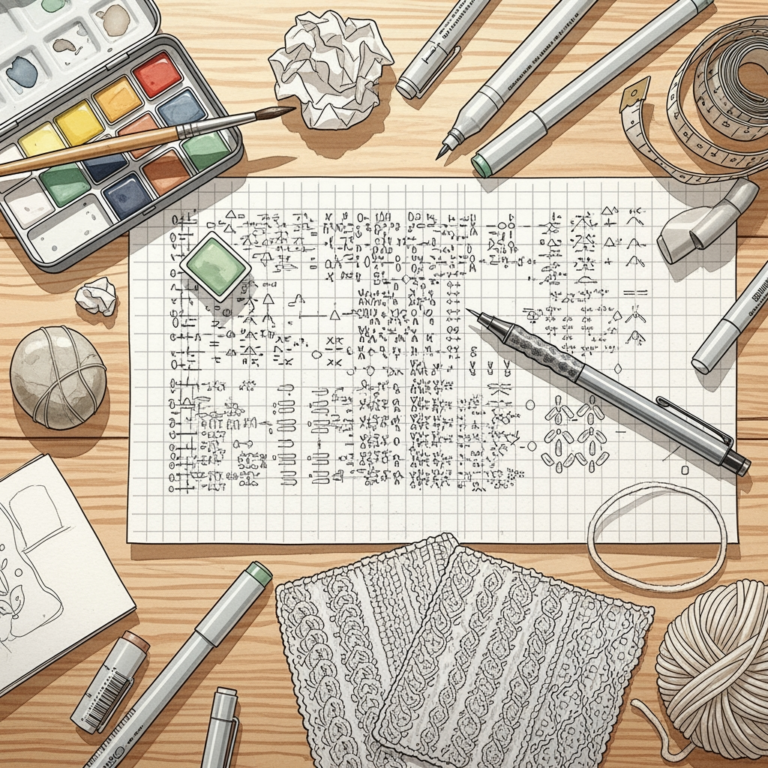
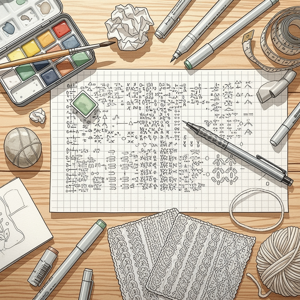
Mastering calligraphy requires the same rhythmic discipline as maintaining a consistent gauge in stranded colorwork. Much like selecting the right needle size to achieve the perfect drape, choosing the correct guide sheet ensures that your letters remain uniform, balanced, and technically sound. Without these structural supports, your writing—like a poorly tensioned cable knit—will inevitably drift and lose its intended shape. These tools provide the necessary framework to turn erratic, uneven strokes into professional, flowing script.
Rhodia Dot Pad: Best for All-Purpose Practice
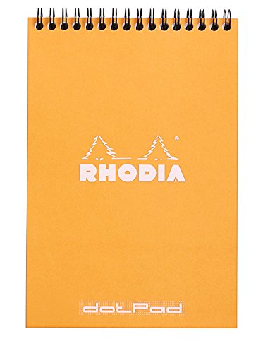

The Rhodia dot pad functions as the workhorse of the calligraphy studio, much like a reliable set of stainless steel needles serves a versatile knitter. Its subtle, unobtrusive grid provides a consistent anchor for letter height without the distracting visual noise of bold, dark lines.
Because the paper surface is exceptionally smooth, it prevents the microscopic snagging that can ruin an elegant ink flourish. This is akin to choosing a high-twist superwash wool that glides effortlessly off the needles, ensuring the ink flows smoothly without feathering or bleed-through.
While these pads are ideal for daily drills, they lack specific slant lines for advanced scripts. Use them for warming up your muscles or mapping out layouts, but keep a more specialized guide on hand for final, formal pieces.
John Neal Copperplate Guides: Best for Pros
Professional-grade Copperplate requires extreme precision, similar to the demands of knitting an intricate, complex lace shawl with fine silk yarn. These specialized guides provide the rigid, non-negotiable structure necessary for high-level technical execution.
The sheets feature meticulously measured slant angles and x-height baselines that prevent the “drift” common in amateur work. When a knitter attempts a delicate lace pattern without a row counter, the result is uneven tension; here, the guide acts as that essential counter, keeping every flourish in its place.
These are not intended for casual doodling or beginners still mastering their pen hold. They represent a commitment to the craft, suitable for those who prioritize structural perfection over creative spontaneity.
Ames Lettering Guide: The Classic Analog Tool

The Ames Lettering Guide is a legendary drafting instrument that serves the calligrapher just as a classic set of wooden needles serves a traditionalist maker. It is an adjustable, mechanical tool that allows for precise, manual customization of line spacing and slant.
Operating this tool requires a steady hand, much like managing a complex three-way cast-on or a tricky kitchener stitch. Once mastered, it provides a level of control that pre-printed paper simply cannot match, as it forces the hand to align with physical stops.
It remains the preferred choice for those who value tactile, mechanical engagement with their tools. It offers total autonomy, ensuring that the spacing is tailored exactly to the height of the current project’s specific requirements.
IAMPETH Printable Guides: Best for Free Option
The International Association of Master Penmen, Engrossers and Teachers of Handwriting (IAMPETH) offers a library of free, downloadable guides. This is the equivalent of accessing a pattern database for standard, reliable motifs before investing in high-end, charted designs.
These resources are essential for those still experimenting with different nibs and ink viscosities. If you are just starting, do not feel pressured to invest in premium paper; these printable sheets provide the exact geometry needed to develop consistent muscle memory.
However, remember that paper quality matters. Printing these guides on standard printer paper will likely lead to ink bleeding, which mimics the fuzzy, uneven halo seen when knitting with loosely spun, low-quality roving.
Cricut BrightPad Go: Best Lightbox Solution

A lightbox like the BrightPad Go transforms any sheet of paper into a guided practice surface by illuminating the grid from beneath. For a knitter, this is comparable to using a dedicated project lamp with magnification, allowing for the precise observation of every individual stitch or fiber alignment.
By placing a master guide sheet under your working paper, you can maintain perfect consistency without the need for drawing faint, erasable lines on your final piece. This is particularly useful when working on heavy, opaque cardstock that would otherwise hide printed guidelines.
This is a significant investment, but it eliminates the need to print individual guides for every project. It allows you to use your preferred high-quality, toothy paper while still benefiting from the structure of a master grid.
Canson Marker Paper: Best for Bleed-Proof Ink
Canson marker paper is specifically engineered to resist ink absorption, ensuring that your lines remain crisp and sharp. In the fiber world, this paper acts much like a high-density, tightly plied yarn that resists pilling and maintains stitch definition despite repeated handling.
Because the ink sits on the surface rather than soaking into the fibers, it allows for more control over edge definition. If you are practicing ornate, complex scripts where ink bleed could bridge the gap between strokes, this paper is an essential safeguard.
Understand that the lack of absorbency means ink drying time will be longer. Allow your work to set properly, just as one must allow a finished garment to block and dry completely before assessing the true gauge and final result.
How to Choose the Right Guide for Your Style
Choosing the right guide requires an honest assessment of your current technical skill and your specific project goals. If you are a beginner focusing on basic stroke construction, prioritize guides with clear, bold baselines and x-height markers to establish fundamental alignment.
If your interest lies in ornate, slanted scripts like Spencerian or Copperplate, a guide with fixed slant angles is non-negotiable. Without these, your lettering will lack the rhythmic flow that defines elegant, formal calligraphy.
Think of this as choosing your needle material; beginners often benefit from the grip of bamboo to slow down their pace, while seasoned makers might prefer the speed and efficiency of slick metal. Select a guide that matches your current tempo, not the one that looks the most impressive in a photo.
Understanding Slant Lines, X-Height, & Ratios
Slant lines act as the “plumb line” for your letters, ensuring they lean consistently across the page. Without these, even the most beautifully executed individual letter will look disconnected and erratic, similar to a sweater where the stitch tension fluctuates wildly between rows.
The x-height refers to the height of your lowercase letters, excluding ascenders and descenders. Maintaining a consistent x-height is the single most effective way to make your writing appear professional, much like ensuring consistent stitch height creates a balanced, professional-looking fabric.
Finally, ratios define the relationship between your ascenders, body, and descenders. A standard 2:3:2 ratio provides a balanced, classical appearance that is essential for readable and aesthetically pleasing compositions.
Using a Lightbox with Opaque Paper Effectively
A lightbox is an indispensable tool for working on specialty or heavy-weight papers that cannot be run through a standard printer. To use it effectively, tape your master guide firmly to the light surface, then overlay your high-quality calligraphy paper.
If you are struggling to see through thicker papers, adjust the brightness settings to compensate for the weight of the fibers. This technique is perfectly analogous to using a light-up knitting needle set or a dedicated task light to trace a complex lace chart placed behind your work.
Always ensure the paper is aligned straight to the grid before starting. A crooked start will compound as you progress down the page, leaving you with a skewed final product that no amount of post-project cropping can fix.
Printable vs. Pre-Made Sheets: Key Differences
Printable sheets offer immediate accessibility and variety, allowing for instant testing of different heights and ratios. They are perfect for discovery, similar to purchasing a few hanks of different yarns to test gauge before committing to a sweater’s worth of material.
Pre-made pads, conversely, offer superior, consistent paper quality that is tested specifically for calligraphy inks. These are the “luxury fiber” of the stationery world—expensive, reliable, and designed to enhance the performance of your tools.
For practice, use the printable options to find what works best for your hand. Once you find your preferred x-height and slant, switch to professional-grade pre-made pads for final pieces to ensure the longevity and professional finish of your work.
Consistency in calligraphy is developed through deliberate repetition and the right environmental supports. By choosing the tools that provide the necessary constraints for your specific style, you will find that your letters begin to align with the same natural rhythm and grace found in a perfectly crafted, hand-knit heirloom.