7 Best Color Theory Charts For Mixing References
Master color mixing with these 7 essential charts. Discover tools to refine your palette, understand harmonies, and achieve precise color accuracy every time.
Choosing the right colors for a project is often just as daunting as selecting the perfect yarn base or needle material. Even the most experienced knitters can find themselves paralyzed by the sheer number of shades available in a single line of wool. Mastering color theory transforms your stash from a random collection of leftovers into a curated palette of intentional design. These seven tools will help you bridge the gap between a vague vision and a finished, harmonious garment.
The Color Wheel Company Pocket Color Wheel Guide


This is the classic tool that every knitter should keep tucked inside their project bag. It is a simple, rotating disc that demonstrates the relationship between primary, secondary, and tertiary colors at a glance.
When you are trying to decide if that neon orange yarn will clash with a deep navy blue, this wheel provides the answer in seconds. It visualizes complementary and analogous schemes, helping you avoid "muddy" results in your stranded colorwork.
The trade-off here is simplicity; it doesn’t account for the subtle undertones of dyed fiber. Use this as your foundational logic to ensure your high-contrast motifs actually pop rather than blurring together.
Pantone Formula Guide for Accurate Color Matching

If you are a designer or someone who needs to match yarn to a specific aesthetic, the Pantone guide is the industry gold standard. It provides a massive library of standardized colors, ensuring that what you see on paper is what you aim for in your fiber.
For the average knitter, this is a significant investment, but it is invaluable if you are sourcing custom-dyed yarns from different indie dyers. It allows you to communicate exact hues, ensuring your "teal" isn’t someone else’s "forest green."
Remember that yarn is three-dimensional and light-absorbent, unlike flat ink on paper. Always view these swatches in natural daylight to get a true sense of how the color will translate to your finished fabric.
The Quilter’s Color Wheel for Fabric Blending

Don’t let the name fool you; this tool is surprisingly effective for knitters who love working with variegated or hand-painted yarns. It focuses heavily on value—the lightness or darkness of a color—which is often more important than the hue itself.
When you are pairing a semi-solid yarn with a complex, multi-colored skein, the value contrast determines the success of the project. If the values are too similar, your intricate cable or lace work will disappear into the background.
Use this wheel to identify the dominant "neutral" in your variegated yarn. Once you find that anchor, you can easily select a solid yarn that complements the underlying tones without competing for attention.
Creative Color Schemes: The 100 Color Palette Book
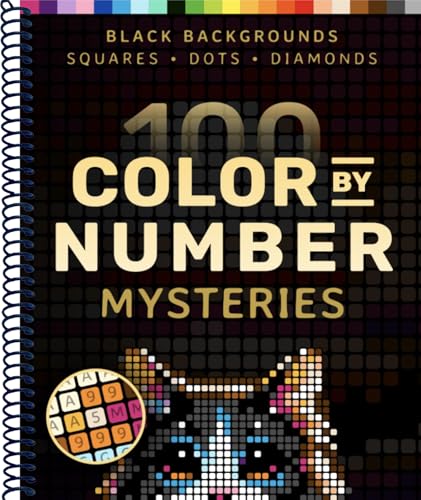
This book is a treasure trove of inspiration for those times when you are stuck in a creative rut. It offers 100 pre-designed palettes, moving beyond basic color theory into the realm of mood and atmosphere.
It is particularly useful for planning large-scale projects like blankets or sweaters with complex intarsia patterns. You get to see how different proportions of color work together, which is a common stumbling block for many makers.
The limitation of a book is that it cannot predict how your specific yarn fiber—be it a fuzzy mohair or a crisp cotton—will reflect light. Take these palettes as a starting point, then swatch your chosen yarns together to see how the textures interact.
Joen Wolfrom’s Ultimate 3-in-1 Color Tool Guide

This tool is a favorite among textile artists because it includes a "value finder" and a "color evaluator" alongside the standard wheel. It helps you see through the "noise" of a busy yarn pattern to identify the base color.
If you are struggling to combine different yarn brands, this tool helps you isolate the undertones. It’s the difference between a "warm" red (with yellow undertones) and a "cool" red (with blue undertones).
Mixing these temperatures incorrectly is the most common reason a project feels "off" even when the colors seem to match. Use this guide to ensure your palette stays either consistently warm or cool for a cohesive, professional look.
Color Harmony Workbook for Fiber Art Projects

This workbook is designed for the knitter who wants to move beyond intuition and into the science of color. It encourages you to create your own swatches and document how different colors behave when placed side-by-side.
It is an excellent way to learn about "simultaneous contrast," where the color of one stitch changes how we perceive the stitch next to it. This is vital for stranded knitting, where the background color can visually shift the foreground color.
Keep this book as a personal record of your successes and failures. Over time, you will build a reference library that is perfectly tailored to your personal style and the specific fibers you enjoy knitting with most.
The Color Index: 1100 Color Combinations Reference
This is a massive, comprehensive resource that is less about theory and more about sheer variety. It provides thousands of combinations, making it the perfect tool for when you have a specific "hero" yarn and need to find supporting colors.
It is particularly helpful for those working with large stashes who need to find ways to use up leftovers. You can look up a color you have in abundance and find a range of palettes that incorporate it naturally.
The sheer volume of choices can be overwhelming, so don’t feel pressured to use every color in a set. Pick three colors—one light, one medium, and one dark—to maintain balance in your project without overcomplicating the design.
Why Color Theory Matters for Your Knitting Palette
Color theory isn’t just about what looks pretty; it’s about how light interacts with your stitches. If you are knitting a complex cable, a dark, highly saturated color will hide your beautiful work, while a lighter, more reflective yarn will make the texture sing.
Furthermore, fiber content changes everything. A matte wool absorbs light, making colors appear softer and more muted, while a silk or nylon blend reflects light, making colors appear brighter and more intense.
Always consider the "halo" of your yarn as well. A fuzzy alpaca will blur the lines between colors in a colorwork pattern, whereas a smooth, tightly twisted merino will keep your edges sharp and your color transitions crisp.
How to Use Color Wheels for Better Yarn Selection
When you are at the yarn store, hold your potential skeins together and squint your eyes until they blur. This simple trick removes the detail and forces you to see the overall value and color intensity of the combination.
Use your color wheel to check the "relationship" between the skeins. If you want a high-contrast look, look for colors directly opposite each other on the wheel. If you want a subtle, sophisticated look, stick to colors that are neighbors.
Remember that the human eye is easily distracted by the label or the "vibe" of a skein. By using a wheel, you detach yourself from the marketing and focus on the cold, hard reality of how those colors will actually sit next to each other in a finished fabric.
Tips for Testing Yarn Combinations Before You Knit
Never trust a ball band or a digital photo to tell you the whole story. The only way to truly know if a color combination works is to knit a small, representative swatch using the actual stitch pattern you intend to use.
If you are doing stranded colorwork, make sure to catch your floats in your swatch to see how it affects the tension and the color distribution. Sometimes, a color that looks great in the skein looks muddy once it’s worked into a dense fabric.
If you are worried about color bleeding, especially with hand-dyed yarns, wash your swatch with a color-catcher sheet. It is far better to find out that a vibrant red bleeds into your white background during the swatching phase than after twenty hours of knitting.
Armed with these tools and a bit of practice, you will find that your color choices become much more intentional and successful. Remember that color is subjective, and there is no "wrong" choice if it brings you joy to knit. Use these charts as a guide to expand your horizons, but always trust your own eye when it comes to the final decision. Happy knitting, and may your next color-work project be your most vibrant one yet.