6 Best Multimedia Papers For Testing Color Combinations
Elevate your art with our expert guide to the 6 best multimedia papers for testing color combinations. Find your perfect surface and start creating today!
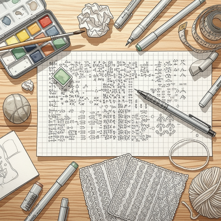
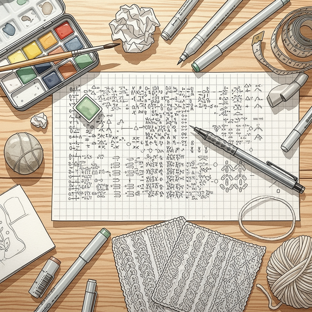
Choosing the right color palette is as critical as selecting the perfect yarn base for a complex stranded colorwork project. Before investing hours in knitting a gauge swatch, testing color combinations on paper helps visualize how saturation and contrast will translate into finished fabric. The following multimedia papers provide the ideal surfaces for sketching, marker testing, and color mapping to ensure the final garment looks exactly as envisioned. These selections focus on durability, ink bleed resistance, and color accuracy, allowing for the kind of precision demanded by intricate fair isle or intarsia patterns.
Canson XL Mix Media Pad: Best Value Overall


This pad serves as the standard workhorse for fiber artists who constantly iterate on color palettes. It balances a mid-range weight with a texture that handles both pencil sketches and saturated marker trials without immediate breakdown.
The surface tooth is sufficient to grip pigment while remaining smooth enough to keep fine lines sharp. For those mapping out a large intarsia sweater, this paper provides enough surface area to experiment with multiple motifs without running out of space.
Because the paper is archival and acid-free, color testing remains stable over the duration of a long-term project. It stands up to repeated erasures, which is essential when adjusting color placement on a charted pattern.
Strathmore 400 Series: Best for Marker Work
Strathmore 400 Series is the preferred choice when working with alcohol-based markers to simulate the saturation of hand-dyed wool. It resists the “bleeding” effect that often turns crisp color charts into fuzzy, unusable blobs of ink.
When simulating stranded colorwork, maintaining the distinction between the dominant and background color is vital. This paper keeps those edges crisp, making it easier to see if two colors will clash or harmonize once the knitting begins.
While the paper is heavier, it remains pliable enough for those who prefer to keep their design charts in a spiral-bound notebook. It offers the professional reliability needed for complex, multi-color projects where the margin for error is slim.
Bee Paper Super Deluxe: Best for Wet Media
For those who use watercolor pencils to mock up space-dyed or variegated yarn effects, the Bee Paper Super Deluxe is unmatched. Its ability to handle moisture prevents the paper from warping when blending colors to mimic soft alpaca or mohair blends.
Fiber artists often need to test how transparent or opaque a color looks when layered, much like testing how a strand of lace-weight silk mohair behaves when held with a solid wool. This paper allows for heavy saturation and blending, providing a realistic look at color depth.
The surface is slightly more absorbent than standard sketching paper, which requires a bit of patience. However, the trade-off is a depth of color that mirrors the complexity of premium fiber blends.
Stillman & Birn Alpha: The Premium Choice
The Alpha series is built for those who treat their color swatching process as a formal design document. With a heavyweight 150gsm rating, it resists buckling under almost any medium, from heavy ink to dense pencil layering.
This paper feels substantial, mimicking the tactile quality of a well-blocked wool swatch. It is the ideal selection for artists documenting long-term design inspiration or creating permanent reference guides for repeating color motifs.
While the cost is higher, the durability ensures that sketches remain protected throughout the entire construction process. It is an investment in professional presentation, especially when designing custom patterns for others.
Arteza Mixed Media Pad: Best Budget Option
The Arteza pad is designed for those who prefer to experiment without worrying about the cost of every sheet used. It is surprisingly resilient for a budget product, offering enough stability for graphite, ink, and light markers.
It performs well for quick, iterative sketches where the focus is on raw color placement rather than artistic longevity. If the goal is to scribble out twenty different colorway ideas for a pair of socks before choosing the final yarn, this is the most economical path.
While it may not handle intense water-based saturation as well as premium options, it hits the perfect middle ground for everyday drafting. It allows for the freedom to fail and restart without hesitation.
Moleskine Art Album: Best for Portability
For the knitter who finds inspiration while commuting or visiting the local yarn shop, the Moleskine Art Album offers unmatched portability. Its compact footprint fits easily into a project bag alongside circular needles and stitch markers.
The paper quality is consistent and reliable, ensuring that thoughts captured on the fly can be developed into full patterns later. It is built to withstand the wear and tear of being tossed into a bag repeatedly.
Using a portable album allows for capturing color inspiration immediately, whether from a landscape or a physical skein of yarn. It bridges the gap between raw inspiration and the structured reality of knitting a garment.
How to Choose the Right Paper for Your Project
Selecting the right paper depends entirely on the medium used to simulate yarn color. If using markers, prioritize bleed resistance and surface smoothness. If using pencils or watercolors, prioritize a toothy texture that catches pigment effectively.
Consider the complexity of the project. A simple two-color hat requires less sophisticated testing than an intricate, five-color Icelandic sweater. The more colors involved, the more important it is to have paper that allows for layering and blending.
Always reflect on the finish of the yarn. If designing for a shiny silk blend, opt for a smoother paper that mimics that reflective quality. For rustic wool, a paper with more visible texture will better simulate the fiber’s inherent matte finish.
Paper Weight (GSM) vs. Tooth: What Matters?
GSM, or grams per square meter, dictates the physical thickness and structural integrity of the paper. A higher GSM ensures the paper can handle heavy applications of ink or water without buckling or tearing, which is crucial for those who heavily edit their designs.
Tooth refers to the surface texture of the paper, which determines how much pigment is deposited from a pencil or charcoal. A higher tooth grabs more pigment, creating soft, blended color shifts that mimic the halo of mohair or the softness of cashmere.
A smooth surface is generally better for markers, as it prevents the ink from feathering out of control. Conversely, a rougher, more toothy surface is essential for colored pencils to layer deeply, allowing for the transition zones seen in variegated hand-dyed yarns.
Tips for Simulating Yarn Texture on Paper
To accurately represent the difference between smooth, worsted-spun yarn and fuzzy, woolen-spun fiber, use varying drawing techniques. Apply pressure with a sharp pencil for crisp, defined lines to mimic tight, plied wool.
For softer, brushed fibers like alpaca, use the side of a soft-lead pencil to create a diffuse, hazy effect. This visual approach highlights the “halo”—the small fibers that extend from the yarn strand—which heavily influences how colors blend in finished knitting.
Use cross-hatching to represent the physical structure of a knit stitch. By replicating the “V” shape of a stitch on paper, the interactions between two different color strands become much easier to predict visually.
Digital Color Tools vs. Paper: A Comparison
Digital color tools offer the advantage of infinite, instant changes to a pattern palette. They are unmatched for efficiency, allowing the user to swap colors in a design with a single click rather than redrawing the entire motif.
However, physical paper tests offer a tactile connection that digital tools lack. Mapping colors on paper requires slowing down, which often forces a more intentional decision-making process regarding contrast and balance.
The best approach often involves a hybrid method: use digital tools for the initial rapid-fire color exploration and paper for the final, physical check. Holding the paper sketches next to the actual yarn skeins provides the most accurate assessment of how light and shadow will interact in the final knit.
Mastering the colorway process is the hallmark of a knitter who prioritizes quality and longevity in their work. By utilizing these tools and techniques, every stitch becomes an informed decision rather than a happy accident. Focus on the interplay of texture and tone, and the finished garment will undoubtedly reflect the care invested at the drawing stage.